“You surf in Lake Michigan?!”
Three years ago, I rented a board on a whim from a local shop. The 75 degree, clear late summer day reminded me of far away tropical places like Hawaii and Puerto Rico. I was hooked. Five surfboards, two wetsuits, and many many snowy surf session later, I wanted a way to predict and notify of surf, but better.
Using real-time meteorological observations, I calculate and notify via SMS message when to surf in Lake Michigan.
A Quick Intro to Great Lakes Surfing
Great Lakes swells are much shorter, smaller, and therefore harder to predict than ocean swells. Instead of large oceanic storms sending waves tens of thousands of miles away, Great Lakes storms rely on hundreds or even tens of miles to whip up waves. Waves last minutes instead of days.
“Good” conditions depend on the bottom structure of your spot, but usually waves larger than 3 feet and more than 6 seconds of period are surfable. We will dive into “perfect” conditions in a future post.
# define "good" conditions
surf_wv_ht <- 1 # meter
surf_wv_per <- 5 # seconds
Check out these free seminars for more info:
There are three main resources I use to forecast waves: * NOAA shipping forecasts * Surf Websites (Surfline or MSW) * Facebook Groups
These resources are great, but lack (free) notifications or do not take into account the nuances of freshwater swells. Each of these resources requires a layer of interpretation on top of them.
The Data
In the summertime, the NOAA places bouys in the lake to take measurements and publishes the data online in 30 minute increments.
The data dictionary and measurement methodology can be found here. (Side note: I learned that “wave heights” are the top 1/3 of wave readings in a given 20 minute time period)
The data for this first project can be found here.
Let’s Surf!
This short project has three main steps: * read in online .txt file * manipulate the data * send text message via Twilio
You can embed an R code chunk like this:
# read in .txt file from the NOAA website
# df_import <- readr::read_delim("https://www.ndbc.noaa.gov/data/realtime2/45013.txt", delim = " ")
# saveRDS(a, '/Users/AndrewMac/Desktop/ata.rds')


df_manipulate <- readRDS('/Users/AndrewMac/Desktop/ata.rds') %>%
  # save only columns we want and rename some columns
  select('#YY', ' MM', 'DD', 'hh', 'mm', 'WDIR', 'WSPD', 'GST', 'WVHT' = ' WVHT', 'DPD' = '  DPD',
         ' WTMP') %>%
  # remove the first row with measurement units
  slice(-1) %>%
  mutate_if(is.character, as.numeric) %>%
  mutate(date = as.POSIXct(paste(`#YY`, "-", ` MM`, "-", `DD`, " ", `hh`, ":", `mm`, sep = ''), format = "%Y-%m-%d %H:%M")) %>%
  select(-c("#YY", " MM", "DD", "hh", "mm")) %>%
  arrange(date) %>%
  # take care of missing values - missing values can either be 0 or missing observation
  replace(is.na(.), 0)

# define "good" surf
b <- a %>%
  mutate(surfs_up = ifelse(WVHT >= surf_wv_ht & DPD >= surf_wv_per, 1, 0),
         perf_cond = ifelse(surfs_up == 1 & WDIR >= surf_wnd_dir, 1, 0),
         # amount of time a strong wind has blown over the lake
         wave_wind = ifelse((WSPD > 6.7 & WDIR >= 315) |
                             (WSPD > 6.7 &  WDIR <= 235), 1, 0),
         wave_wind_time = ifelse(wave_wind == 1, sequence(rle(as.character(wave_wind))$lengths), 0)
         ) %>%
  arrange(desc(date))

ggplot(b, aes(date, WVHT, color = factor(surfs_up))) +
  geom_point()

# there there is surf within the past hour, send a text
if (b[1,8] == 1 | b[1,8] == 1) {
  message <- paste("Surf's Up! Waves are "
                ,  df_output[1,3]
                , " ft."
                , sep = "")

twilio::tw_send_message(from = Sys.getenv("twilios_phone_number")
                          , to = Sys.getenv("my_number")
                          , body = message)
} else
{

}
Including Plots
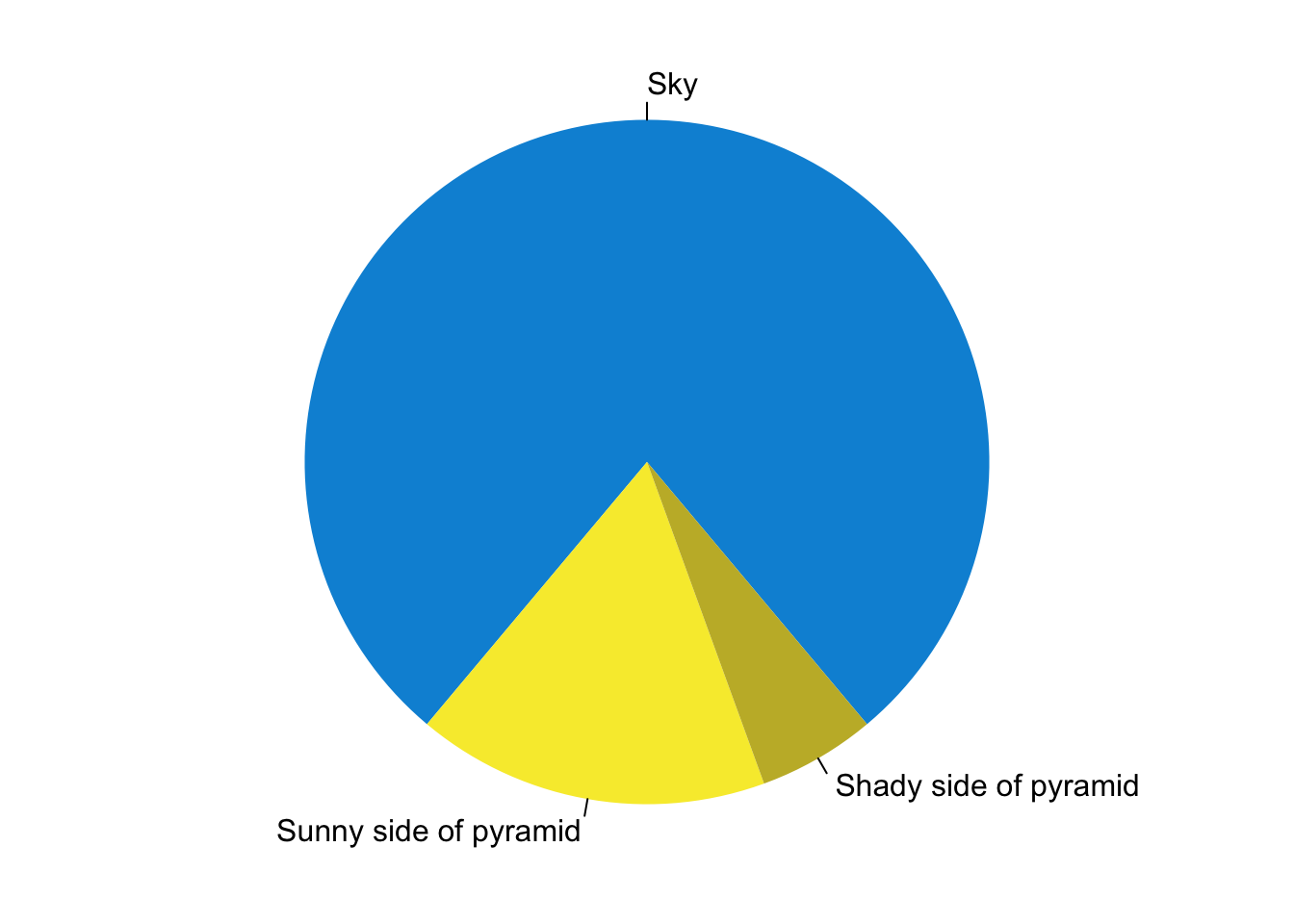
You can also embed plots. See Figure 1 for example:
par(mar = c(0, 1, 0, 1))
pie(
  c(280, 60, 20),
  c('Sky', 'Sunny side of pyramid', 'Shady side of pyramid'),
  col = c('#0292D8', '#F7EA39', '#C4B632'),
  init.angle = -50, border = NA
)
Figure 1: A fancy pie chart.